Visual Customization
All customization properties can be set as attributes on CropImageView (crop prefix):
<com.theartofdev.edmodo.cropper.CropImageView
xmlns:custom="http://schemas.android.com/apk/res-auto"
android:id="@+id/cropImageView"
android:layout_width="match_parent"
android:layout_height="0dp"
android:layout_weight="1"
custom:cropGuidelines="on"
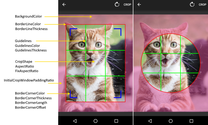
custom:cropShape="oval"
custom:cropBorderLineColor="@android:color/holo_red_dark"
custom:cropGuidelinesColor="@android:color/holo_green_dark"/>or set for CropImageActivity using builder (set prefix):
CropImage.activity(imageUri)
  .setGuidelines(CropImageView.Guidelines.ON)
  .setCropShape(CropImageView.CropShape.OVAL)
  .setBorderLineColor(Color.RED)
  .setGuidelinesColor(Color.GREEN)
  .start(this);
some are possible to change at run-time on CropImageView instance:
cropImageView.setGuidelines(CropImageView.Guidelines.ON);
cropImageView.setCropShape(CropImageView.CropShape.OVAL);Default: Rectangle
Set crop window shape to Rectangle or Oval, use FixAspectRatio for Square / Circle.
Default: on-touch
Whether the guidelines within the crop window will be displayed.
- off: no guidelines will be displayed.
- on: guidelines will always be displayed.
- on-touch: guidelines will be displayed when the crop window is touched.
Default: false
Fixes the aspect ratio. If this is turned off, the crop window will reset and default to the size of the image, but with 10% padding on each side. If this is turned on, the crop window will reset and expand as much as possible given the aspect ratio.
Default: 1 / 1
Sets the X value of the aspect ratio, where the aspect ratio is equivalent to X / Y.
