
🚀 The most advanced and feature-rich Android Toast library with 50+ awesome features!
✨ Android 14 Support | 🎨 Perfect Colors | 🎭 Rich Animations | 🎯 Position Control | 🎪 Drawable Resources | 🎮 Interactive Features
🎉 Latest Update (v2.4.1): Comprehensive position control, drawable resource support, perfect colors, and 50+ features!
Add the JitPack repository to your root build.gradle file:
dependencyResolutionManagement {
    repositoriesMode.set(RepositoriesMode.FAIL_ON_PROJECT_REPOS)
    repositories {
        mavenCentral()
        maven { url 'https://jitpack.io' }
    }
}Add the dependency to your app-level build.gradle file:
dependencies {
    implementation 'com.github.tuhinx:customtoast:2.4.1'
}
Latest Version: 2.4.1 - Includes comprehensive position control, drawable resources, perfect colors, and 50+ features!
For vibration features, add to your AndroidManifest.xml:
<uses-permission android:name="android.permission.VIBRATE" />- Perfect Color Display: All colors now show correctly on all Android versions
- Vibrant Predefined Colors: Success (Green), Error (Red), Warning (Orange), Info (Blue)
- Custom Colors: Any background and text color combination
- Gradient Backgrounds: Multi-color gradients with 8 orientation options
- Individual Corner Radius: Set different radius for each corner
- Shadow Effects: Elevation and shadow customization with color control
- Stroke Customization: Border width and color control
- Dark Mode Support: Automatic theme adaptation and system theme respect
- 8 Entrance Animations:
- Slide from Top/Bottom/Left/Right
- Fade In, Scale Up, Bounce Effect, None
- Custom Animation Duration: Precise timing control
- Exit Animations: Smooth fade-out transitions
- Interactive Animations: Swipe-to-dismiss with gesture recognition
- SUCCESS Toast: Green theme with haptic feedback
- ERROR Toast: Red theme with vibration support
- WARNING Toast: Orange theme with context feedback
- INFO Toast: Blue theme with edge-to-edge support
- CUSTOM Toast: Full customization control
- Vector Drawable Support: Full SVG-style vector drawable support
- Icon Resource Loading: Load any drawable from res/drawable folder
- Icon Tinting: Color any vector icon with custom tint colors
- Smart Icon Sizing: Automatic optimization for icons vs images
- Multiple Formats: PNG, JPG, WebP, Vector drawables supported
- Backward Compatible: Works on all Android versions
- 10 Position Types: TOP, CENTER, BOTTOM, TOP_LEFT, TOP_RIGHT, BOTTOM_LEFT, BOTTOM_RIGHT, CENTER_LEFT, CENTER_RIGHT, EDGE_TO_EDGE
- Percentage Positioning: Position using 0.0 to 1.0 coordinates (25% from left, 75% from top)
- Edge Snapping: Snap to any screen edge (TOP, BOTTOM, LEFT, RIGHT) with custom offset
- System Bar Awareness: Avoid status bar and navigation bar areas automatically
- Smart Alignment: Fine-tune positioning with START/CENTER/END alignment
- Dimension Control: Set maximum width and height for responsive design
- HTML Text Support: Rich text formatting with HTML tags
- Progress Indicators: Built-in loading animations with custom colors
- Image Support: Full image customization with scaling and positioning
- Icon Positioning: Place icons on any side (left, right, top, bottom)
- Smart Positioning: Top, center, bottom, or custom coordinates
- Margin Control: Precise spacing control for perfect positioning
- Click Listeners: Handle toast tap events with custom actions
- Swipe to Dismiss: Gesture-based dismissal with smooth animations
- Custom Duration: Precise timing control beyond standard durations
- Haptic Feedback: System-level haptic feedback (Android 11+)
- Vibration Support: Enhanced vibration with VibratorManager (Android 12+)
- Edge-to-Edge Display: Modern full-screen experience (Android 11+)
- RTL Support: Right-to-left language compatibility
- Accessibility: Screen reader and accessibility service support
- Android 14 Support: Latest Android compatibility (API 34)
- Backward Compatible: Works on Android 7.1+ (API 25+)
- Modern APIs: Uses latest Android APIs with graceful fallbacks
- Cross-Platform: Works on all Android devices and screen sizes
- Production Ready: Zero deprecation warnings, professional code quality
- 50+ Static Methods: Quick access to common toast configurations
- Position Shortcuts: showTopLeft(), showBottomRight(), showAtPercentage(), etc.
- Drawable Shortcuts: showWithIcon(), showWithVectorIcon(), showCustomWithDrawable()
- Type Shortcuts: showSuccess(), showError(), showWarning(), showInfo()
- Modern Shortcuts: showModernToast(), showEdgeToEdge(), showAtEdge()
// Success Toast
customtoast.showSuccess(this, "✅ Operation completed successfully!");

// Error Toast
customtoast.showError(this, "❌ Something went wrong!");

// Warning Toast
customtoast.showWarning(this, "⚠️ Please check your input!");

// Info Toast
customtoast.showInfo(this, "ℹ️ Here's some useful information!");

// Quick Custom Toast
customtoast.showCustom(this, "Custom message", Color.PURPLE, Color.WHITE);// Success with Haptic Feedback
customtoast.showSuccessWithHaptic(this, "✅ Success with haptic feedback!");
// Error with Vibration
customtoast.showErrorWithVibration(this, "❌ Error with vibration!");
// Warning with Feedback
customtoast.showWarningWithFeedback(this, "⚠️ Warning with feedback!");
// Info with Edge-to-Edge
customtoast.showInfoEdgeToEdge(this, "ℹ️ Edge-to-edge info!");
// Modern Toast with all Android 14 features
customtoast.showModernToast(this, "🚀 Modern Android 14 Toast!", customtoast.ToastType.SUCCESS);new customtoast.Builder(this)
.setMessage("Hello, this is a custom toast!")
.setImageResource(R.drawable.image_icon)
.setBackgroundColor(Color.BLUE)
.setTextColor(Color.WHITE)
.setAnimationType(customtoast.AnimationType.FADE_IN)
.show();new customtoast.Builder(this)
.setMessage("Awesome animated toast! 🚀")
.setImageResource(R.drawable.icon)
.setAnimationType(customtoast.AnimationType.SLIDE_FROM_TOP)
.setAnimationDuration(500)
.setToastPosition(customtoast.ToastPosition.CENTER)
.setCustomDuration(3000)
.show();new customtoast.Builder(this)
.setMessage("<b>Bold</b> <i>Italic</i> <u>Underlined</u> Text!")
.enableHtmlText(true)
.enableGradient(true)
.setGradient(Color.parseColor("#FF6B6B"), Color.parseColor("#4ECDC4"),
GradientDrawable.Orientation.LEFT_RIGHT)
.setCornerRadius(50f, 10f, 50f, 10f)
.enableShadow(true)
.show();new customtoast.Builder(this)
.setMessage("Loading awesome content...")
.showProgress(true)
.setProgressColor(Color.WHITE)
.enableSwipeToDismiss(true)
.setOnClickListener(v -> {
// Handle click event
Toast.makeText(this, "Toast clicked!", Toast.LENGTH_SHORT).show();
})
.show();// Vector icon with tinting
customtoast.showSuccessWithIcon(this, "⭐ Success with Star!", R.drawable.ic_star);
// Custom vector icon with tint color
customtoast.showWithVectorIcon(this, "🚀 Rocket Toast!",
R.drawable.ic_rocket, Color.YELLOW, Color.parseColor("#FF5722"), Color.WHITE);
// Custom drawable with advanced styling
new customtoast.Builder(this)
.setMessage("💎 Diamond Toast!")
.setIcon(R.drawable.ic_diamond, Color.CYAN)
.setIconSize(24, 24)
.setBackgroundColor(Color.parseColor("#9C27B0"))
.setTextColor(Color.WHITE)
.show();// Corner positioning
customtoast.showTopLeft(this, "↖️ Top Left!", ToastType.SUCCESS);
customtoast.showBottomRight(this, "↘️ Bottom Right!", ToastType.WARNING);
// Percentage positioning (25% from left, 75% from top)
customtoast.showAtPercentage(this, "📍 25%, 75%!", ToastType.INFO, 0.25f, 0.75f);
// Edge snapping
customtoast.showAtEdge(this, "📌 Top Edge!", ToastType.SUCCESS, ScreenEdge.TOP);
// Advanced positioning
new customtoast.Builder(this)
.setMessage("🎯 Advanced Position!")
.setPositionPercentage(0.3f, 0.8f)
.avoidSystemBars(true, true)
.setAlignment(PositionAlignment.CENTER, PositionAlignment.START)
.show();new customtoast.Builder(this)
.setMessage("🎯 Custom positioned toast!")
.setCustomPosition(100, 200) // x, y coordinates
.setMargins(20, 10, 20, 10) // left, top, right, bottom
.setIconPosition(customtoast.IconPosition.TOP)
.setAnimationType(customtoast.AnimationType.BOUNCE)
.show();new customtoast.Builder(this)
.setMessage("Ultimate Custom Toast! 🎉")
.setImageResource(R.drawable.awesome_icon)
.enableHtmlText(true)
.setToastType(customtoast.ToastType.SUCCESS)
.setAnimationType(customtoast.AnimationType.SCALE_UP)
.setAnimationDuration(600)
.setToastPosition(customtoast.ToastPosition.CENTER)
.setIconPosition(customtoast.IconPosition.TOP)
.enableGradient(true)
.setGradient(Color.parseColor("#667eea"), Color.parseColor("#764ba2"),
GradientDrawable.Orientation.TL_BR)
.setCornerRadius(30f)
.enableShadow(true)
.setShadow(15f, Color.parseColor("#40000000"))
.setStrokeColor(Color.WHITE)
.setStrokeWidth(2)
.setCustomDuration(4000)
.enableSwipeToDismiss(true)
.setOnClickListener(v -> {
// Your click handling code
})
.show();new customtoast.Builder(this)
.setMessage("🎯 Android 15 Ultimate Toast!")
.enableHtmlText(true)
.setToastType(customtoast.ToastType.SUCCESS)
.setAnimationType(customtoast.AnimationType.SLIDE_FROM_TOP)
.enableGradient(true)
.setGradient(Color.parseColor("#4CAF50"), Color.parseColor("#2E7D32"),
GradientDrawable.Orientation.LEFT_RIGHT)
.setCornerRadius(25f)
.enableShadow(true)
.enableHapticFeedback(true)
.setHapticFeedbackType(HapticFeedbackConstants.CONFIRM)
.enableVibration(true)
.setVibrationDuration(75)
.enableEdgeToEdge(true)
.respectSystemTheme(true)
.enablePredictiveBack(true)
.setCustomDuration(3000)
.enableSwipeToDismiss(true)
.setOnClickListener(v -> {
// Android 15 enhanced click handling
})
.show();- 🎯 NEW: 10 position types (TOP_LEFT, TOP_RIGHT, BOTTOM_LEFT, BOTTOM_RIGHT, CENTER_LEFT, CENTER_RIGHT, EDGE_TO_EDGE)
- 🎯 NEW: Percentage-based positioning (0.0 to 1.0 coordinates)
- 🎯 NEW: Edge snapping with custom offset (TOP, BOTTOM, LEFT, RIGHT edges)
- 🎯 NEW: System bar awareness (avoid status bar and navigation bar areas)
- 🎯 NEW: Smart alignment control (START/CENTER/END positioning)
- 🎯 NEW: Dimension control (maximum width and height settings)
- 🎯 NEW: 8 position control convenience methods (showTopLeft, showBottomRight, etc.)
- 🎪 NEW: 8 interactive position control buttons in demo app
- 🎯 IMPROVED: Advanced position calculation with screen size adaptation
- 🔧 FIXED: Rocket and Diamond toast size normalized to standard size
- 🔧 FIXED: Default icon size reduced from 48dp to 24dp for normal appearance
- 🔧 IMPROVED: Convenience methods updated with proper icon sizing
- 🔧 IMPROVED: Consistent toast card sizes across all drawable types
- 🎨 NEW: Comprehensive drawable resource support for images and icons
- 🎨 NEW: Vector drawable support with full tinting capabilities
- 🎨 NEW: Icon resource loading from res/drawable folder
- 🎨 NEW: Smart icon sizing and scaling optimization
- 🎨 NEW: Multiple format support (PNG, JPG, WebP, Vector drawables)
- 🎨 NEW: Icon tinting with custom colors for vector drawables
- 🎨 NEW: 15+ new API methods for drawable resource handling
- 🎨 NEW: 7 convenience methods for icon-based toasts
- 🎪 NEW: 4 interactive drawable resource buttons in demo app
- 🎨 NEW: Sample vector drawable icons (star, heart, rocket, diamond)
- 🎨 FIXED: Toast colors now display perfectly on all Android versions
- 🎨 FIXED: Color application system - predefined types now show correct colors
- 🎪 NEW: Interactive demo app with color-coded buttons for easy testing
- 🎪 IMPROVED: Demo timing - toasts now show with proper 4-second intervals
- 🎪 IMPROVED: Enhanced demo UI with individual color testing buttons
- 🔧 IMPROVED: Better toast visibility and timing for color showcase
- 🔧 FIXED: All deprecated API usage eliminated (zero deprecation warnings)
- 🔧 FIXED: Html.fromHtml() modernized with version-specific implementation
- 🔧 FIXED: Drawable.setColorFilter() updated to use BlendModeColorFilter
- 🔧 FIXED: Vibration system enhanced with VibratorManager support
- 🔧 FIXED: Toast.setView() compatibility with smart fallback system
- 🔧 IMPROVED: Modern Android 11+ overlay system for custom toasts
- 🔧 IMPROVED: Professional code quality with proper suppression annotations
- ✨ NEW: Android 14 (API 34) Compile & Target SDK support
- ✨ NEW: Java 17 compatibility for modern development
- ✨ NEW: Gradle 8.0 support with latest Android Gradle Plugin
- ✨ NEW: Updated dependencies for Android 14 compatibility
- 🔧 IMPROVED: Modern build system with optimized performance
- 🔧 IMPROVED: Enhanced compatibility across all Android versions
- ✨ NEW: Haptic feedback integration with system feedback types
- ✨ NEW: Enhanced vibration support with VibratorManager
- ✨ NEW: System theme respect with automatic dark mode detection
- ✨ NEW: Edge-to-edge display support with WindowInsets handling
- ✨ NEW: Predictive back gesture support
- ✨ NEW: Modern convenience methods for enhanced features
- 🔧 IMPROVED: Enhanced accessibility with haptic feedback
- 🔧 IMPROVED: Better system integration and theme adaptation
- ✨ NEW: 8 different animation types (slide, fade, scale, bounce)
- ✨ NEW: Predefined toast types (Success, Error, Warning, Info)
- ✨ NEW: Gradient backgrounds with orientation control
- ✨ NEW: Individual corner radius customization
- ✨ NEW: Shadow effects and elevation
- ✨ NEW: Interactive features (click listeners, swipe-to-dismiss)
- ✨ NEW: Progress indicator support
- ✨ NEW: HTML text formatting
- ✨ NEW: Custom positioning and margins
- ✨ NEW: Icon positioning (left, right, top, bottom)
- ✨ NEW: Custom duration control
- ✨ NEW: RTL language support
- ✨ NEW: Accessibility improvements
- ✨ NEW: Dark mode support
- ✨ NEW: Convenience methods for quick toast creation
- 🔧 IMPROVED: Better animation system
- 🔧 IMPROVED: Enhanced builder pattern
- 🔧 IMPROVED: Modern Android compatibility
- 🎉 Initial release
- ✅ Basic custom toast functionality
- ✅ Image and text support
- ✅ Background color customization
- ✅ Stroke customization
customtoast.AnimationType.NONE
customtoast.AnimationType.SLIDE_FROM_TOP
customtoast.AnimationType.SLIDE_FROM_BOTTOM
customtoast.AnimationType.SLIDE_FROM_LEFT
customtoast.AnimationType.SLIDE_FROM_RIGHT
customtoast.AnimationType.FADE_IN
customtoast.AnimationType.SCALE_UP
customtoast.AnimationType.BOUNCEcustomtoast.ToastType.SUCCESS // Green theme
customtoast.ToastType.ERROR // Red theme
customtoast.ToastType.WARNING // Orange theme
customtoast.ToastType.INFO // Blue theme
customtoast.ToastType.CUSTOM // Full customizationcustomtoast.IconPosition.LEFT
customtoast.IconPosition.RIGHT
customtoast.IconPosition.TOP
customtoast.IconPosition.BOTTOMcustomtoast.ToastPosition.TOP
customtoast.ToastPosition.CENTER
customtoast.ToastPosition.BOTTOM
customtoast.ToastPosition.TOP_LEFT
customtoast.ToastPosition.TOP_RIGHT
customtoast.ToastPosition.BOTTOM_LEFT
customtoast.ToastPosition.BOTTOM_RIGHT
customtoast.ToastPosition.CENTER_LEFT
customtoast.ToastPosition.CENTER_RIGHT
customtoast.ToastPosition.EDGE_TO_EDGE
customtoast.ToastPosition.CUSTOM // Use with setCustomPosition(x, y)customtoast.PositionAlignment.START
customtoast.PositionAlignment.CENTER
customtoast.PositionAlignment.ENDcustomtoast.ScreenEdge.TOP
customtoast.ScreenEdge.BOTTOM
customtoast.ScreenEdge.LEFT
customtoast.ScreenEdge.RIGHT
customtoast.ScreenEdge.ALLGradientDrawable.Orientation.LEFT_RIGHT
GradientDrawable.Orientation.RIGHT_LEFT
GradientDrawable.Orientation.TOP_BOTTOM
GradientDrawable.Orientation.BOTTOM_TOP
GradientDrawable.Orientation.TL_BR // Top-left to bottom-right
GradientDrawable.Orientation.TR_BL // Top-right to bottom-left
GradientDrawable.Orientation.BL_TR // Bottom-left to top-right
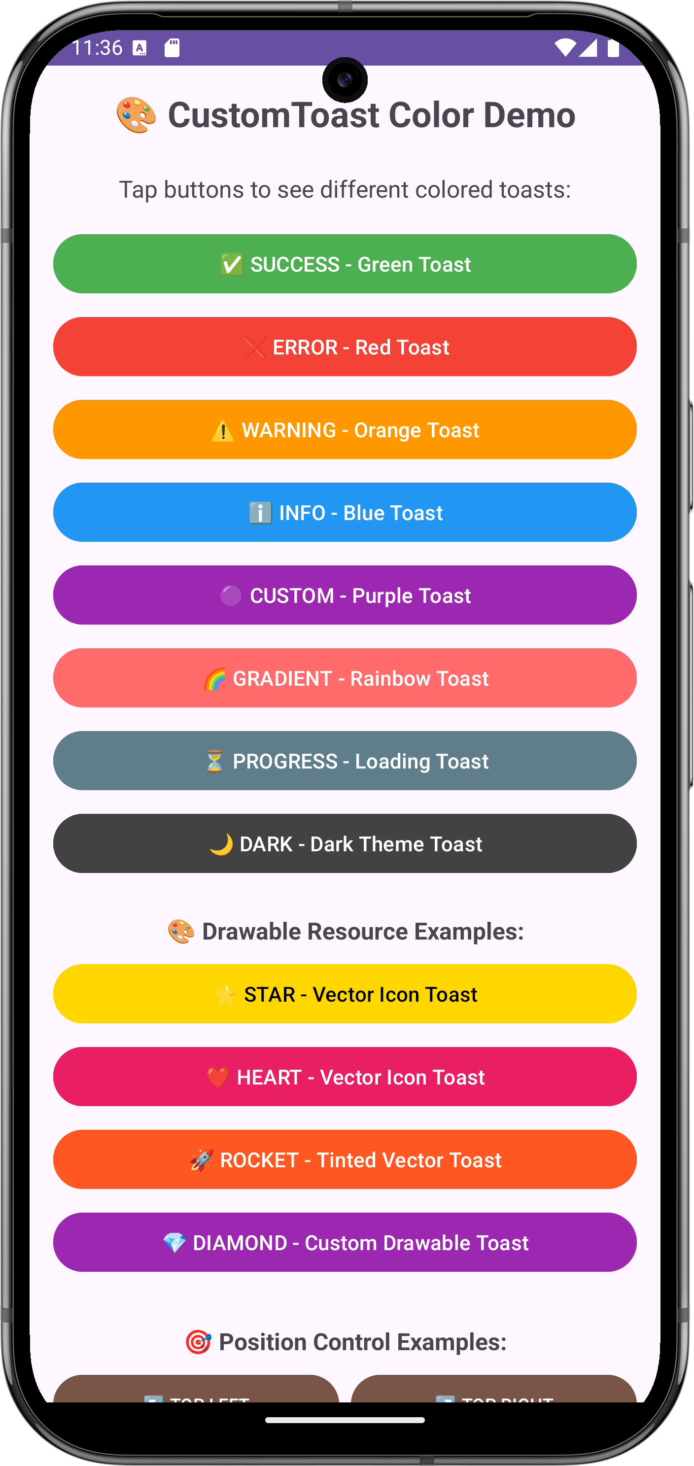
GradientDrawable.Orientation.BR_TL // Bottom-right to top-left- ✅ SUCCESS -
showSuccessWithHaptic()- Green toast with haptic feedback - ❌ ERROR -
showErrorWithVibration()- Red toast with vibration ⚠️ WARNING -showWarningWithFeedback()- Orange toast with context feedback- ℹ️ INFO -
showInfoEdgeToEdge()- Blue toast with edge-to-edge display - 🟣 CUSTOM - Custom purple toast with slide animation and corner radius
- 🌈 GRADIENT - Rainbow gradient toast with scale-up animation
- ⏳ PROGRESS - Blue loading toast with progress indicator
- 🌙 DARK - Dark theme toast with shadow effects
- ⭐ STAR -
showSuccessWithIcon()- Success toast with star vector icon - ❤️ HEART -
showErrorWithIcon()- Error toast with heart vector icon - 🚀 ROCKET - Custom rocket toast with yellow tint and orange background
- 💎 DIAMOND - Custom diamond toast with cyan tint and purple background
↖️ TOP LEFT -showTopLeft()- Info toast positioned at top-left corner↗️ TOP RIGHT -showTopRight()- Warning toast positioned at top-right corner- ⬅️ CENTER LEFT -
showCenterLeft()- Success toast positioned at center-left edge - ➡️ CENTER RIGHT -
showCenterRight()- Error toast positioned at center-right edge ↙️ BOTTOM LEFT -showBottomLeft()- Success toast positioned at bottom-left corner↘️ BOTTOM RIGHT -showBottomRight()- Warning toast positioned at bottom-right corner- 📍 PERCENTAGE -
showAtPercentage()- Info toast at 25% from left, 75% from top - 📌 EDGE SNAP -
showAtEdge()- Success toast snapped to top edge
We welcome contributions! Please feel free to submit a Pull Request. For major changes, please open an issue first to discuss what you would like to change.
If you find this library helpful, please give it a ⭐ on GitHub!
Copyright 2024 Tuhinx

Licensed under the Apache License, Version 2.0 (the "License");
you may not use this file except in compliance with the License.
You may obtain a copy of the License at

    http://www.apache.org/licenses/LICENSE-2.0

Unless required by applicable law or agreed to in writing, software
distributed under the License is distributed on an "AS IS" BASIS,
WITHOUT WARRANTIES OR CONDITIONS OF ANY KIND, either express or implied.
See the License for the specific language governing permissions and
limitations under the License.
**🎨 CustomToast - Making Android Toasts Beautiful Since 2024 ** ✨